How to create seven brands
simultaneously
deepico is a software company that builds an ERP in the cloud for the food industry. The platform is broken down into six verticals, and historically, each one sported a wildly different visual identity.
To fix the visual chaos, I brought everything together under a unified sub-brand concept. I built out a cohesive design system for all seven brands, equipping each with a matching logo, distinct color palette, and a custom icon.

Fig 1: The evolution of the logo
When spelled in lower case, “deepico” consists mainly of circular characters. So I first explored the pure geometry, then built a custom font out of it and (finding it a bit bland) started to search for something geometrical, that’s highly usable a lot more practcal than a bespoke font. Going to Century Gothic first as an obvious choice I landed on Montserrat. It’s geometric but runs slightly wider and is all in all a bit more fun. Also, it’s a variable Google font, which makes it ideal for use in a web based software environment.
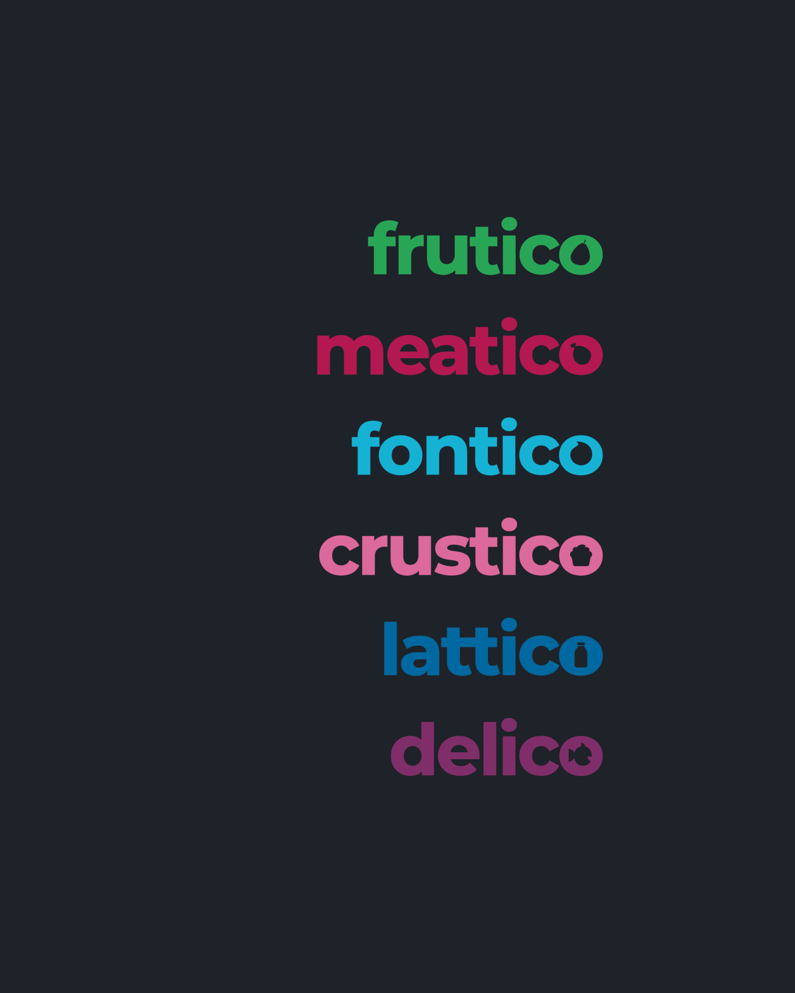
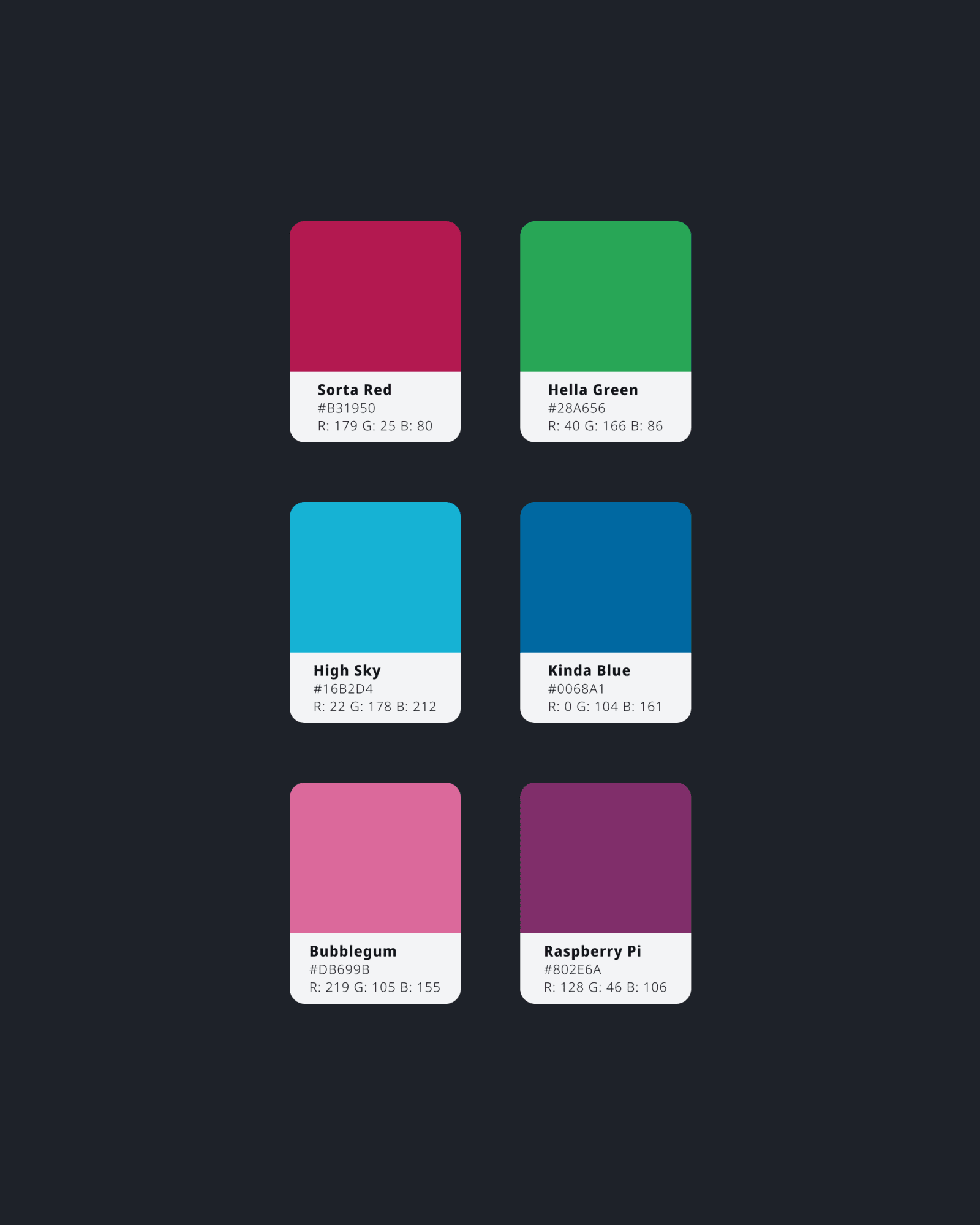
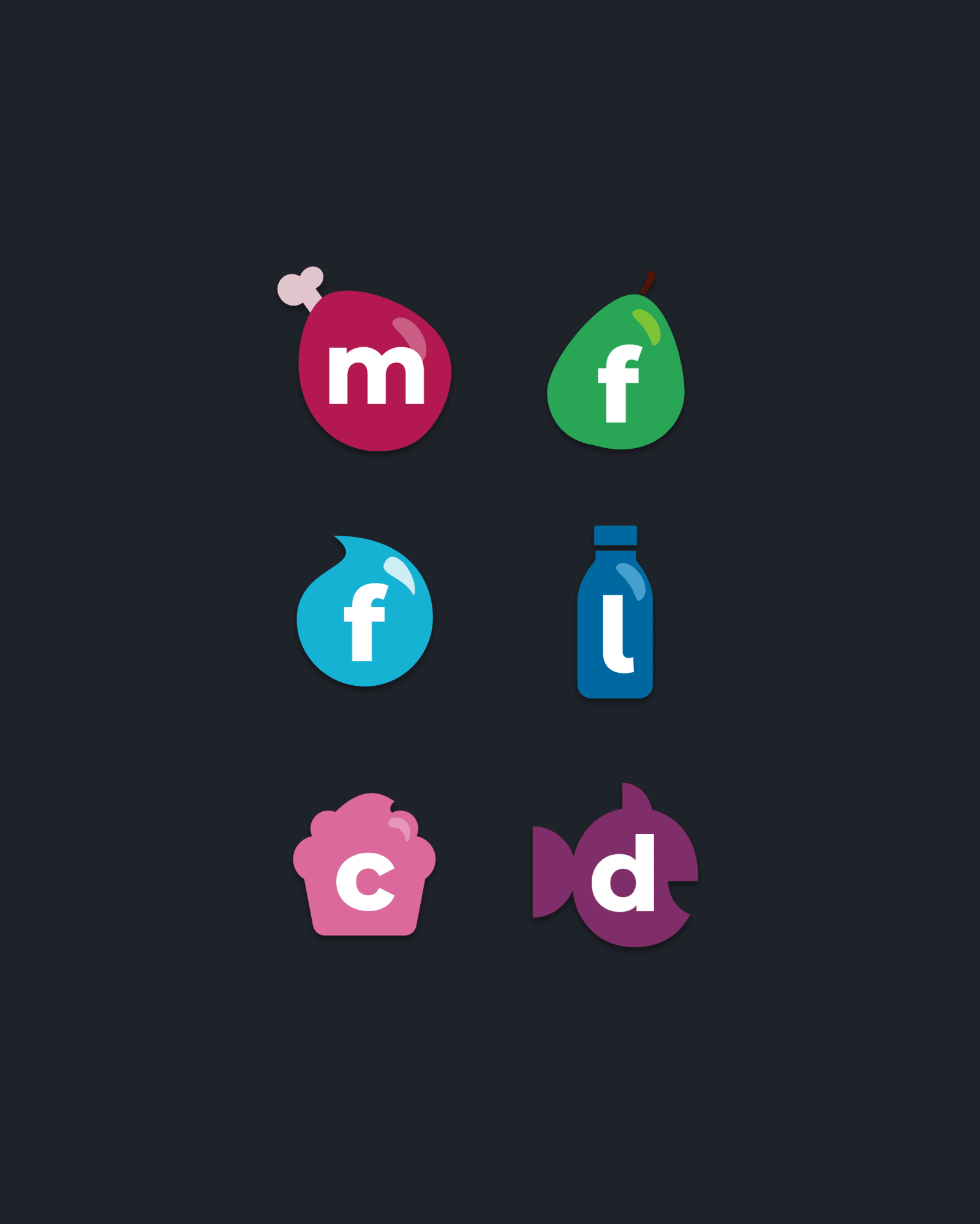
For the individual brands, I decided to go with a different color scheme for each vertical. Since the brand names all end in -ICO I tuned the O’s counter into a negative of the brands icon, to add a little bit of fun.
The icons themselves are based on the vertical and in themselves had to work as the counter for the Os. This meant both logos and icons had to be developed at the same time and constantly matched to see if they work.